





(01)
(Vorlia)
© 2026
Vorlia is a B2B operations platform built for the hospitality and retail industry — scheduling, inventory, team management, all in one place. The brief was to build a visual identity from scratch that could hold its own against established SaaS products while staying approachable for the people actually using it on the floor.
Client
Ian Gallo
DELIVERABLES
Logo, Pattern, Colour System, LinkedIn Banner
Year
2026
Role
Brand Designer
(02)
(Brand Identity)
© 2026
Vorlia had a product. What it didn't have was a visual identity to match. No logomark, no system, no visual language that could hold its own next to established SaaS platforms. The brief wasn't just to make something look better — it was to build something from scratch that communicated precision, trust and speed, while staying approachable for the people actually using it on the floor every day.

The logomark was built on a precise geometric grid — every angle, curve and negative space deliberate. The hook at the top references forward motion. The negative space at the base creates tension and balance simultaneously. The result is a mark that reads instantly at any size, from a 16px favicon to a full-scale wall graphic, without losing its character.

The wordmark sits optically centred to the visual mass of the mark — not its mathematical midpoint. A deliberate decision that keeps the two elements reading as one system rather than two separate parts placed next to each other.
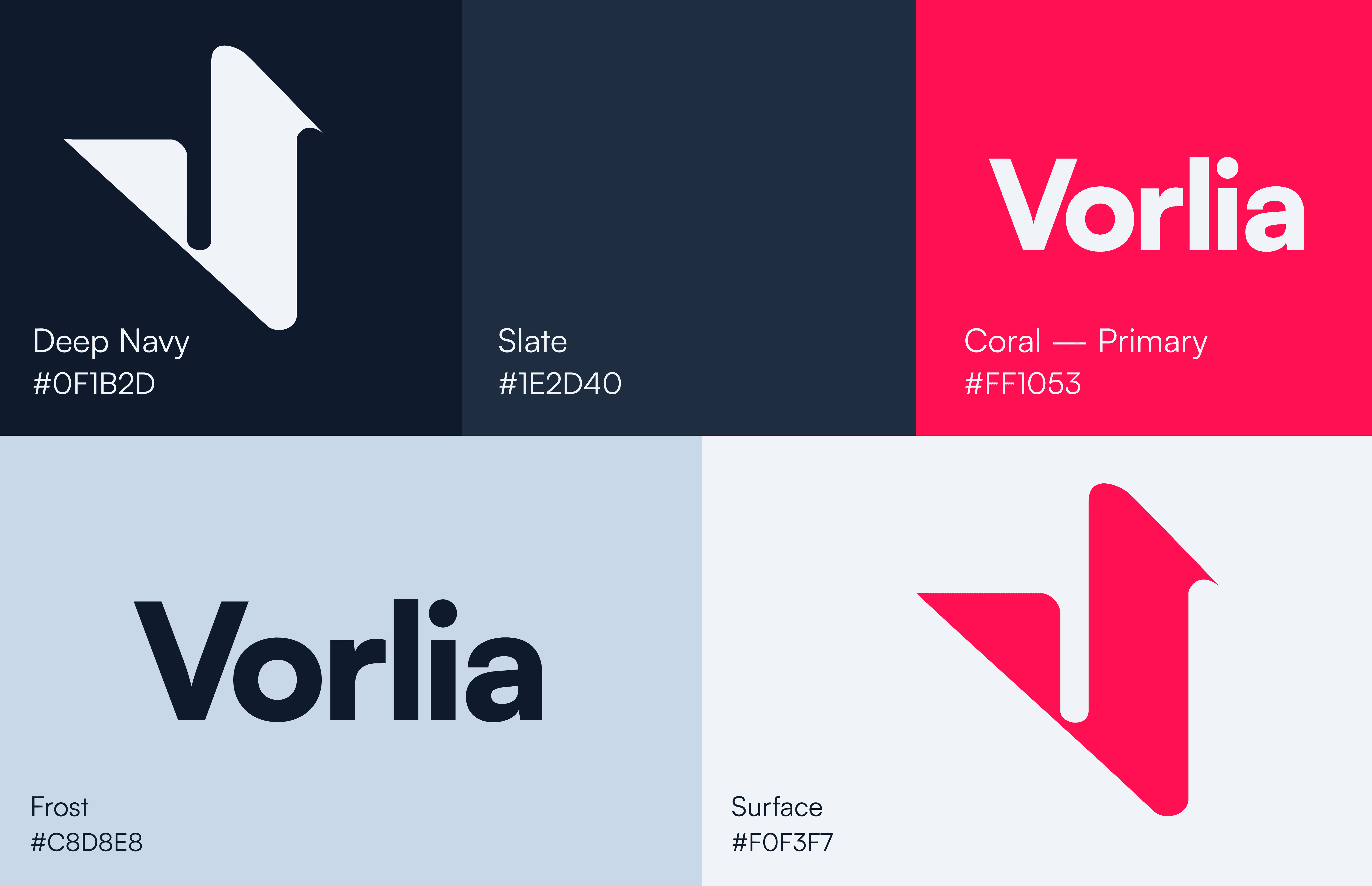

COLOR — A case for doing it differently.
Four colour directions were developed and presented to challenge the original palette. Each one was built around the psychology of the target audience — hospitality managers, shift leaders, operations teams. Colour in B2B is not decoration. It is the first signal of whether a product can be trusted.


The pattern emerged directly from the logomark during the design process — unplanned, but immediately recognisable as belonging to the same system. Repeated diagonally, it creates rhythm and texture across any surface without losing the identity behind it.


Vorlia launched with a complete visual identity that positions it as a serious operator in the B2B SaaS space. The logomark, pattern system and colour directions give the product the visual infrastructure to grow — across platforms, touchpoints and markets.
(03)
(Work with me)
© 2026

(04)
(Other Projects)
© 2026


